
Case studies
What I change, and why.
Client projects and worked examples across product pages, funnels, landing pages and service websites. No invented numbers.


Before
After
Product page
Product page rebuilt around the brand story, so browsers understand the value before they scroll.
Clearer call to action
Made the next step visible earlier and easier to act on.
Cleaner visual hierarchy
Reduced clutter and guided attention to what matters most.
Earlier trust cues
Brought proof and reassurance closer to the buying decision.
Stronger product story
Turned the page into a clearer narrative around value and impact.


Before
After
Service website
From a quote and a stock video to a site that tells people how to start.
Who, what, where
The headline says what she does and where, built for local search too.
One clear first step
Request a first consultation, repeated down the page.
Reassurance under the button
Reply within 24 hours, confidentiality, in person or online.
Credentials up front
Experience since 1980, certifications and register number, for a high-stakes choice.


Before
After
Subscription funnel
An 11-step journey cut to 5, so first-time visitors reach checkout with fewer decisions.
One clear value proposition
The first screen says what the box is and who it's for, instead of a carousel trying to say everything at once.
Fewer competing offers
Discount banner, free gifts, timer and add-ons reduced to one offer that's easy to understand.
One clear next step
A single primary action on each step of the funnel, so attention isn't split.
Reassurance before the button
Ratings and the 30-day guarantee moved up to where the decision happens.

Before
After
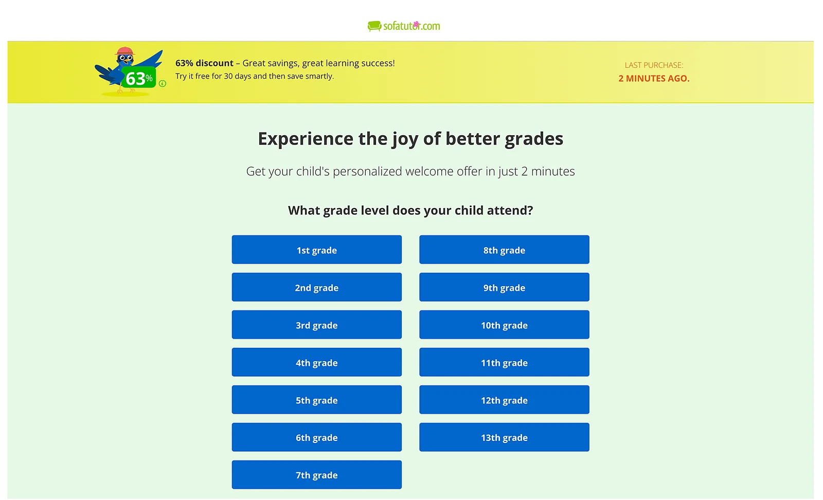
Paid-traffic landing page
A Meta ad landing page rebuilt around a smaller first step, so paid visitors start instead of bouncing.
Lower-effort start
Parents begin with their child's name on the page, not a 13-button grade quiz.
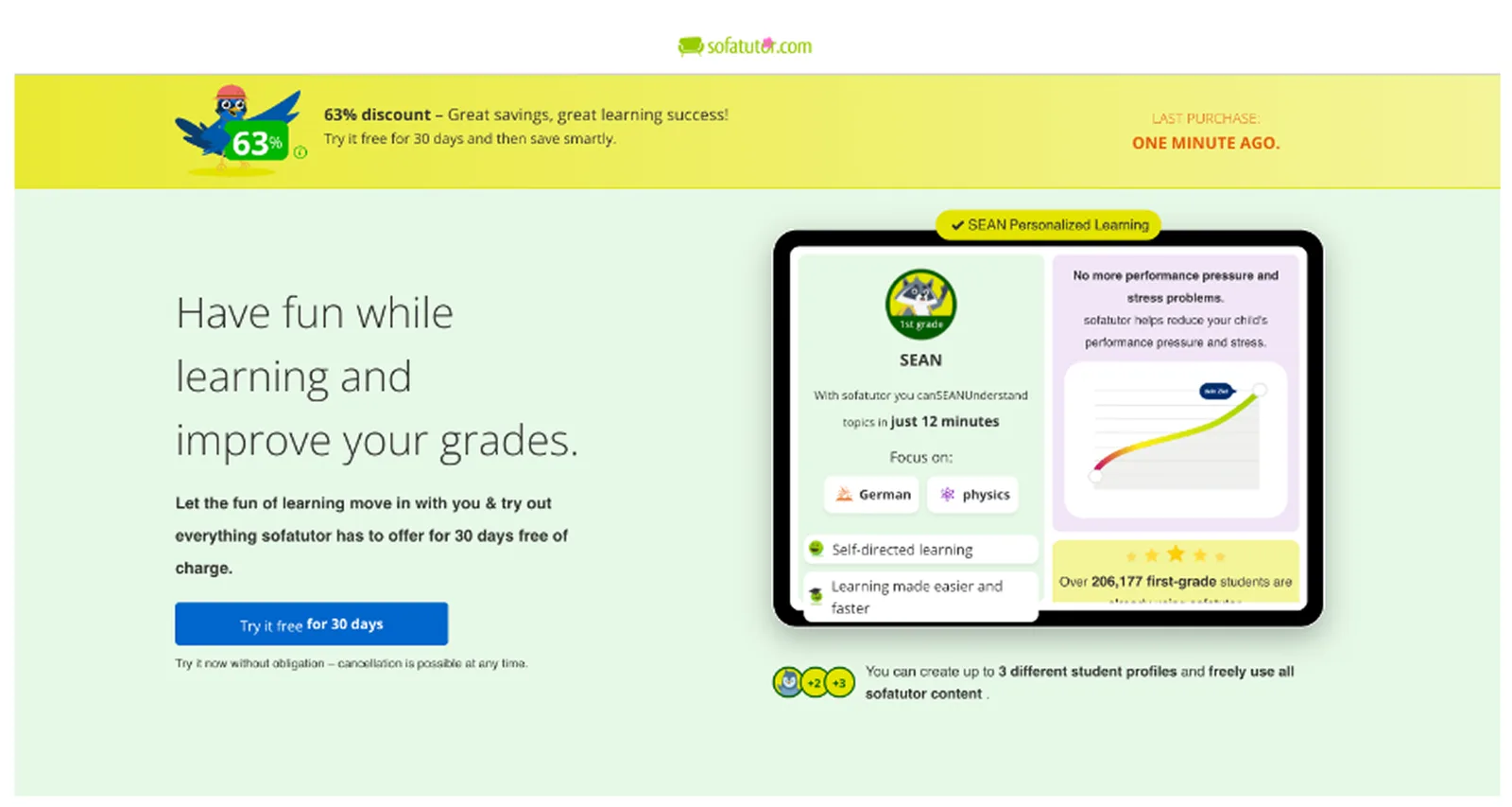
Matches the ad's promise
"Create your child's plan" replaces a "Start trial" button that led to questions instead.
Value before effort
Ratings, results and the offer are visible before anyone is asked for anything.
Effort made visible
A clear "under 30 seconds" and a progress bar, so the quiz feels short.
Before
After
Pricing page
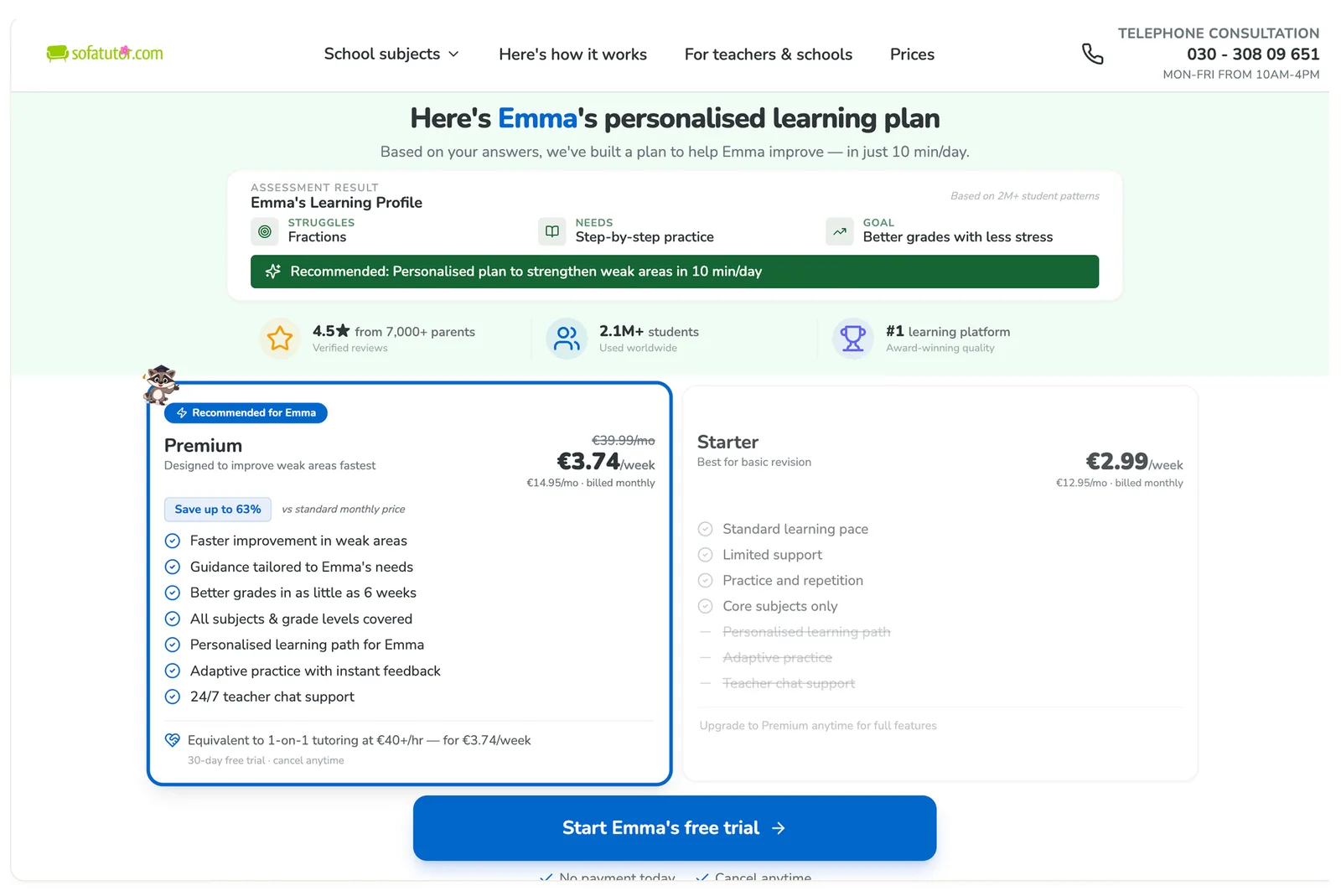
A post-quiz pricing page turned into one decision block, so parents see their plan, price and reassurance without scrolling.
A real payoff from the quiz
Pricing opens on the child's personalised plan, not a generic price list.
Clear, anchored pricing
The weekly price shown against the full price, so the discount is credible.
One recommended plan
Premium is highlighted and explained, so parents compare less and decide faster.
Reassurance by the button
Free trial, no payment today and cancel anytime, right where the decision happens.
Your site next?
Want to know what I'd change on yours?
A free expert review of your website in 1 to 2 days.
Book free review call